When it comes to rebranding a business, success is crucial for the continued survival of any company. Without proper thought process, research, and execution mean that the product reaches the decline stage untimely or a negative public opinion spreads – neither of which is good news for a company. The goal is always to evolve with the time and revitalize their business while keeping their current customers as happy as possible.
This, of course, can be a balancing act. There are many different aspects to consider before taking the plunge with a rebrand. The good news is, by studying how other companies have successfully navigated the rebranding process; we can make their successes our own.
Successful rebranding happens when the company utilizes one or more of these seven strategies:
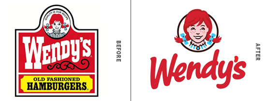
1) They stay true to their heritage – to successfully pave the way for the future, you must always consider your past. Continuing to lean on your heritage and original foundation of values will help you enhance your credibility through the rebranding process. Be sure to pull the elements which resonate most with your client/customer base and truly signify who you are. Take Wendy’s rebrand for instance. When they updated their brand and more specifically, their logo, they were sure to pull through their heritage to their redheaded namesake. They freshened up her look and gave their wordmark a fresh, new font. But at a glance, it’s easy to still connect with the heritage vibe Wendy’s has always offered.

When: The new logo was rolled out in March of 2013, along with redesigns of their restaurants – both inside and out. They launched four different test stores: ultra-modern, contemporary, urban, and traditional.
Why: Wendy’s spokesperson, Denny Lynch stated, “In the quick-service industry, you have to be top of mind to remain relevant. Our food was good, our operations were good – but we needed to be current.”
Who: The redesign was handled by Tesser, an award-winning branding agency based out of San Francisco.
Research: In the midst of the redesign, the company found there were three key elements that needed to be preserved in some form: the redheaded girl with pigtails, the same color red, and the way Wendy’s wordmark/font swerves upward.
Outcome: The outcome was a more mature Wendy, with a fresh typography look and feel.
Public Response: Most of the public response has been very positive. While there have been a few people who were surprised by the drastic change in typography, most have embraced the new look. The store redesigns have had equal success, boosting the inflow of customers.
Overall Success: After the remodels and the new look were launched, annual sales increased by 25% on average – helping Wendy’s perform almost as well as brand new builds.
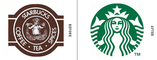
2) They go all in – While staying true to a brand’s heritage is important, being in the now is equally so. Once you invest in your brand change, don’t panic if at first, people haven’t jumped on board. Move forward confidently, incorporate what you’ve learned through your years, but if it helps, pretend the old brand (as it was) never existed. Today is all there is – and remind your customers this new, improved version is where everything is at. Think about the original Starbucks Coffee logo. While it was originally modeled after a 16th-century Nordic woodcut, and symbolized the nautical origin of the Starbucks namesake, a more sophisticated version developed over the years. Sure, it still makes the prudish types squirm a bit, but they stayed true to their heritage (going back to that number 1), and simply went all in with their now tastefully done up Siren of Starbucks. Does anyone miss the old logo? Probably not.

When & Why: In 2011, to celebrate the 40th anniversary in business, the company came up with a new variation of their siren logo. It’s now joined the ranks of the elite few who are so recognizable; they can drop their wordmark and still be completely recognizable.
Who: The logo was designed in-house at Starbucks, but did have refinements handled by Lippincott – a branding firm with locations all over the world.
Research: The idea for the rebrand was to open Starbucks to more than just coffee. Over the years, they’ve also dabbled in music, ice cream, and even alcohol. Even though you might not know it, the new logo came to be after hundreds of iterations, even going back to their roots for inspiration. Ultimately, the senior creative manager at Starbucks has said, the answer was ultimately found in its simplicity.
Outcome: While the wordmark was the big change, the redesign wasn’t overly mind-blowing. Overall, the Siren herself is almost identical to its 1992 counterpart. If you’re looking closely, you might catch the subtle differences though: a rounder smile, a slightly thinner face, a new nose, and a bit more curves.
Public Response: As with most of what Starbucks does, the relinquishing of the wordmark was met with mixed reviews. Some, including CNN Money, didn’t overly love the new look when it first launched.
Overall Success: Through the past six years, it’s safe to say the update has been a good thing. It gave the company flexibility to explore different avenues for the Starbucks brand while maintaining a globally recognizable brand.
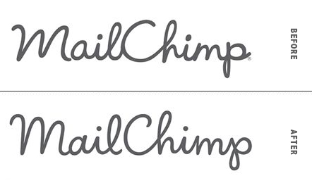
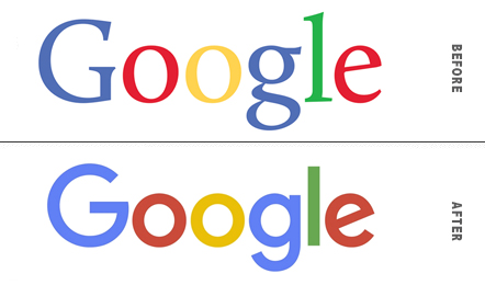
3) They consider the tweak as much as the total revamp – There’s something to be said about the head-turning full-on revamp. However, that can implode a company’s reputation if they’re not extremely careful. Many successful companies consider the rebrand “tweak” to be just as important as a total revamp. Take Mail Chimp and Google for example. Both were well-established brands, who wanted to make small tweaks to their current look – simply to adjust for the times. In fact, if you weren’t paying attention, they could have gone unnoticed altogether. Take a look:

When: Updated in 2013, the new Mail Chimp logo is definitely a success story.
Why: Mail Chimp’s Ron Lewis wanted to give their current logo mark a facelift to help with legibility, particularly at smaller sizes.
Who: The updated logo was designed and developed by Jessica Hische.
Research: For all the details, check out Jessica’s case study on the rebrand.
Outcome: The end result was a lighter, but still playful rendition of the Mail Chimp logo. Its heritage was clearly pulled through, while still being able to freshen up the logo to have an updated feel.
Public Response: Due to the subtle nature of the redesign, most Mail Chimp users didn’t even notice the change at first. Since its release, it’s been highly acclaimed as a redesign success story by the public.
Overall Success: Across most platforms, the redesign has been raved as a stellar evolution of an already playful logo. Its updates have enhanced it in all the right places.

When: In 2015, Google redesigned their logo mark with a fresh new san serif typeface.
Why: The way consumers interact with Google has changed since its inception. Because it is used across multiple platforms and devices, Google wanted a fresh branding family to go along with it.
Research and Insight: Google has a lot of great information on how they evolved the Google brand and identity.
Outcome: The final product was a simpler typographic logo mark with increased legibility thanks to its San serif font – and flexibility to span across multiple products.
Public Response: Public review has been fairly quiet on the redesign. Perhaps this is because Google has changed their logo a number of times, and even played with it as a form of expression. But being quiet isn’t necessarily a bad thing. Sometimes it means the change was subtle enough to do the job and bold enough not to upset the base.
Overall Success: With the idea of mobile friendliness backing the redesign, the updated logo and branding have certainly led the way to a new mobile standard. It’s safe to say; the update passed with flying colors.
4) They listen to their brand ambassadors – Before any rebranding gets accomplished, successful companies always turn to their most loyal fan base to understand what they’re doing right (so they can keep right on doing it!). The goal is not to completely reinvent, but to meld together the aspects, they’re doing well while enhancing and supplementing to the areas that could use some work. Ultimately, it is to make the brand more successful and appealing, without losing the interest of the people who love them the most.
5) They counter the critics – As brands grow, so do the critics who want to drag them down. The difference with successful companies when they rebrand is that they take their critics seriously. Take McDonald’s for instance: While they were the number one fast food restaurant in America for a long time, their establishment became synonymous with an unhealthy diet and lifestyle which was directly linked to obesity. In order to combat this new perception, McDonald’s had to listen to their critics to find out how to best counter their biggest critics and change their brand perception. This has meant incorporating healthier food options, taking an active stance in fighting obesity, and even a rebranded image. They may have to continue to pivot and continue to make efforts to silence critics, but taking the step to listen carefully was definitely a turning point.

Photo credit: McDonald’s Corporate
6) They want to appeal to a cause – Your values and mission statement should be seamlessly tied to any rebranding process. In 2017, it’s extremely clear that consumers want to support businesses that resonate with the beliefs and values they hold dear. This can be applied to various aspects of a brand’s business, but often it comes in the form of the supporting branding: causes they contribute to or support supplies they purchase, etc.
7) They’re open & honest through the process – Rebranding is not for the faint of heart. But you’d be surprised how much customers understand when they’re clued in. By giving glimpses and insights into the rebranding process – or even asking for their input, you may find your rebrand goes far more smoothly than anticipated.
While no two rebranding strategies will be exactly alike, they do have enough similarities that we can follow their common thread. It comes down to staying true to your heritage, listening to both the people who love your company and those who are critical, standing for something bigger than yourselves, and looking at all the options. If you can balance all of that, or at least focus on a few that are critical to you, your rebranding should be just as successful as the ones above.
– Artwork Abode


