In an increasingly visual society, images have taken on a life of their own in many instances. As a case in point, consider logos as a follow-up to our previous post on cost of designing a world-class logo. Some of the most successful businesses in the world are immediately recognizable by their corporate logo symbols. To better understand how logo design tastes have evolved over time; please join us on a short journey through time.
A Search for Identity

Religions created some of the most recognized identity marks, which are some of the world’s best known symbols since a long time.
The precious value of a visual identity was initially perceived long before today’s businesses entered the scene — 5000 B.C. by some estimates. Whether the earliest conscious use of symbols took place in Egypt, Transylvania, China or somewhere else is open to some scholarly debate. What we do know is that Egyptian marks and symbolically-inscribed pots produced by Transylvanian artisans both emerged several thousand years ago.
Just as a contemporary logo on a luxury automobile can enhance value and promote corporate identity, the “best” pots made over 7,000 years ago were often distinguished by the personal mark of a particularly skillful potter. The practical value of symbols for expressing complicated ideas was not lost on early religious leaders — the Judaic Star of David, the Islamic crescent moon and the Christian cross are enduring testaments to the long-lasting legacy of thoughtfully-designed symbols.
Driven by Prestige
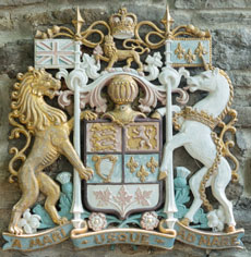
As we fast forward to the 12th century in our exploration of logo design tastes, the coat of arms became the “go to” symbol for the nobles of the day. The art of designing a coat of arms was called “heraldry” — from the very beginning, this specialized design field was elevated to a position of prominence. Nothing was left to chance, and a coat of arms became a complex statement of aspirations and royal lineage. The nobles did not hesitate to pass along mementos bearing their personal coat of arms to soldiers and others as a reminder of their allegiance to the royal family.

The resulting royal seals and coats of arms were literally seen everywhere you can imagine: book bindings, tableware, clothing, shields, entryways, flags and armor. Religious bodies, municipalities and institutions eventually perceived the benefits of adopting their own variation of a coat of arms to represent a visual statement of prestige. The historical journey of logo design tastes as influenced by coats of arms made its next logical stop in Canada when French and English explorers brought symbolic traditions with them starting in the 15th century. As compelling evidence that the design practices of heraldry have not lost their power in today’s digital age, the Duchess of Cambridge — Kate Middleton — received her personal coat of arms from Queen Elizabeth II during 2011.
Inspired by Art

“While boys are entertained by nuts and youths by dice…we hammer out emblems made by the distinguished hand of craftsmen” ~ Andrea Alciato, 1531
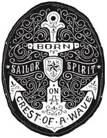
The evolution of logo design tastes shifted toward emblems in the 15th century and then with mottos three centuries later. An emblem is usually thought of as a symbol representing a concept or organization — for example, an olive branch is an internationally-recognized emblem or symbol of peace. On the other hand, mottos involve short word phrases that capture desirable ideals — as one common illustration, the motto of the Los Angeles Police Department and many other law enforcement organizations is “To Protect and to Serve.”
Through both poetry and graphic artworks, a natural evolution was to associate mottos with emblems. Equally important to this transition was the use of popular slogans like “Give Me Liberty or Give Me Death” during 18th century military conflicts.
Marked by Tradition

It is believed that traditional logos have become popular in the 19th & 20th centuries – thanks to our many universities and schools for adopting such designs that can be seen even today.
The historical march of logo design tastes in the 19th century brings us to the re-emergence of trademarks and birth of the modern logo. While modern trademarking does have its beginnings in the Victorian era and Industrial Revolution of the 1800s, distinctive trademarks were initially used with guild stamps on Chinese pottery about 4,000 years ago and a cruder version of personal marks on Transylvanian pottery as much as 3,000 years earlier — by any measure, those 7,000 years of usage provide a healthy dose of tradition for the trademark.
During this period, the economy began a massive shift from an agrarian one to a business environment built around industry and commerce. With increasing competition becoming a reality for newly-created commercial ventures, business owners needed a striking form of visual identification for their enterprises and work culture. The logo now appears to be a natural solution based upon the preceding 7,000 years or so — our logo design taste journey has taken us from basic symbols to coats of arms and then to emblems and mottos followed by trademarks and modern logos.
Known for Simplicity

In today’s digital age, logos are found to be simple (yet interesting) to ensure compatibility with multiple devices, print and web platforms.
With a complex coat of arms as a forebearer of the modern logo, you might think that logos would have become more complicated in the modern age — in reality, digital design techniques have demonstrated that “simpler is better.” The ability to use overly-complex logos across platforms as diverse as billboards, websites, stationery, badges, television, business cards and other media can become a challenge that you will rarely win.
What can you do? Simplify the logo beginning with the earliest design phases. The Digital Revolution — including logo-enhancing software such as Adobe Photoshop — has led us to a faster and more efficient method for designing logos. Nevertheless, logo design tastes have come full circle in one critical way: Simplicity is as important today as it was 7,000 years ago. Even the most advanced concept-driven logo should exemplify simplicity in how it provides a striking visual identity.
Aiming for Distinction

The latest trend of 3D logos are chiefly designed for high-resolution media displays. This type of logos give a stunning look on websites and TV ads.
Logo design tastes are likely to continue changing as we move forward. 3D logos are one of the latest logo evolutions that can help companies to successfully complete a re-branding process. Even without a desire to re-brand a business, a logo change can be a powerful tool that can help smart business owners and corporate executives to gain vital media and customer attention.
When your company designs its initial logo — or changes its logo — the goal is to use symbolic icons that set your business apart from the competition. You should not relax until your corporate identity includes a distinctive logo.
– Artwork Abode
Artwork Abode


