Importance of Design Layout for Engagement and Improved Sales
Graphic design layout makes content more comprehensive, meaningful and ensures that your message comes across effectively, especially when used with the right imagery, typography, and color.
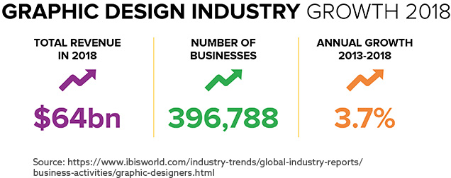
The global graphic design industry has demonstrated impressive growth in 2018 (Fig 1), which validates the impact graphic design has on advertising, marketing, and idea communication through thoughtfully laid out visualizations.
Layout and the seven principles of graphic design are directly tied to graphic design success and depend on how elements of graphic design are positioned and relate to each other.
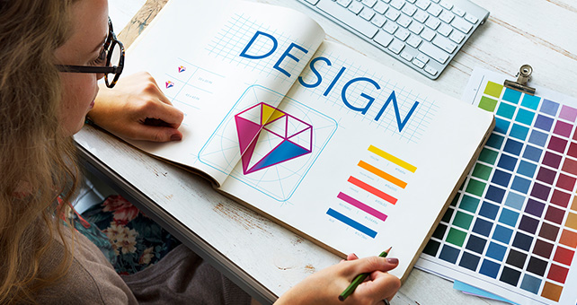
Graphic design essentials can convert, inform, and educate viewers while providing other benefits:
- Brand recognition
- Professionalism
- Communicate ideas
- Generate Loyalty and credibility
- Improve Sales and visibility
- Attract customers
Graphic Design Layouts and the Elements that Influence Them
Like playing a musical instrument, or creating a complex cuisine, graphic design elements, like color, texture, shape, and line, are combined with elements of graphic design like rhythm, proportion, and movement to produce a successful and harmonious design layout.
Types of Layouts:
Mondrian Layout
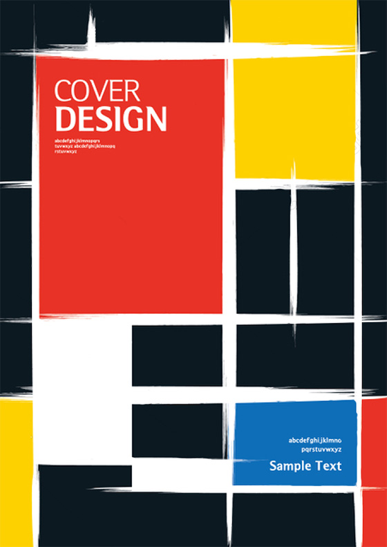
Forms in every field (landscape, portrait, square) are positioned parallel to the scope of presentation and creates a conceptual composition.
Circus Layout
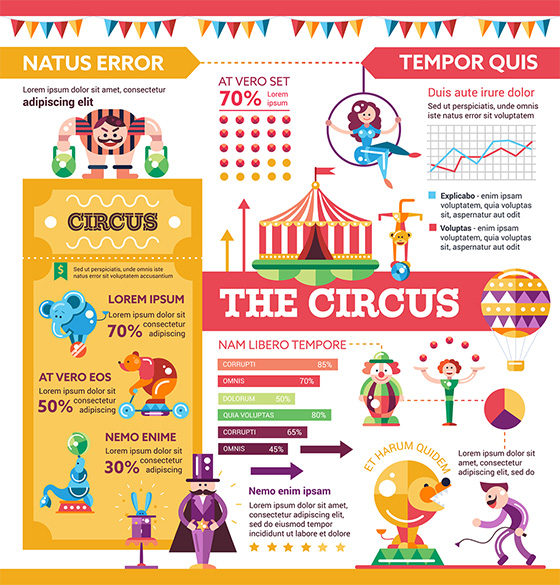
Defined by its irregular arrangement of components that provides a surprising effect.
Multi-panel Layout
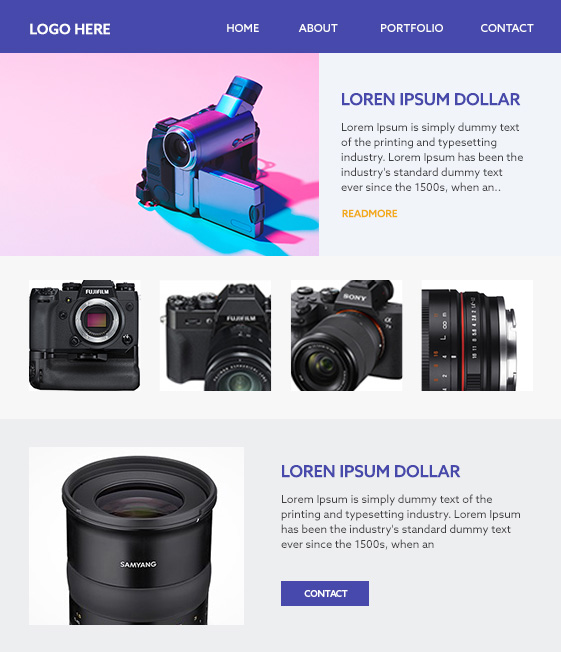
Segments, different sections, or themes are presented in one shaped like a cube, square, or rectangle.
Silhouette Layout

Uses an illustration or photographic method to highlight a form in shadow, creating a stark contrast. It can be shown through shaped text-wrap or spot color illustration, or with refracted smooth image pickup.
Big Type Layout
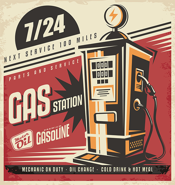
Uses font, size, and style, to catch viewer attention and are often used for headlines.
Alphabet-Inspired Layout
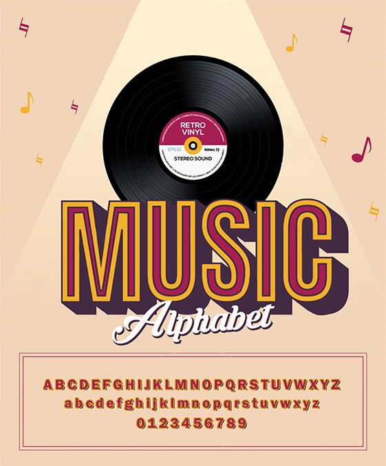
Uses letters and numbers in composition to form a word or convey a story or unique message for advertising.
Essential Graphic Design Elements for a Great Layout
Graphic design principles, such as Typography, Color Theory, and Page Layout, are important technical elements for designers to utilize to form a great layout that brings a design together, and factor into the seven principles of graphic design.

Typography
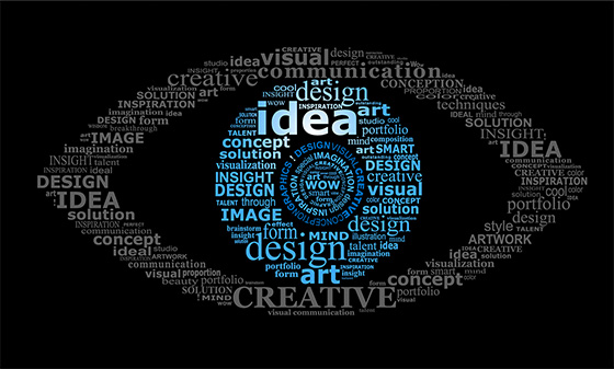
The typeface is just as crucial as color, images, or graphics to create a professional, memorable, and distinct design style, and can even be used to form pictorial or narrative compositions.
Color
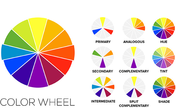
Color evokes emotion and has strong connotations to mood, and cultural perception, and is used by brands to communicate certain messages and context or trigger sentiment in audiences.
Colors are also linked to emotional and physical reactions:
Blue: Calming
Purple: Artistic and spiritual
Red: Confidence, energetic
Yellow: Triggers memory
Orange: Stability and activeness
Green: Harmonious, soothing
Black: Mysterious
White: Purity and Clarity
Whitespace
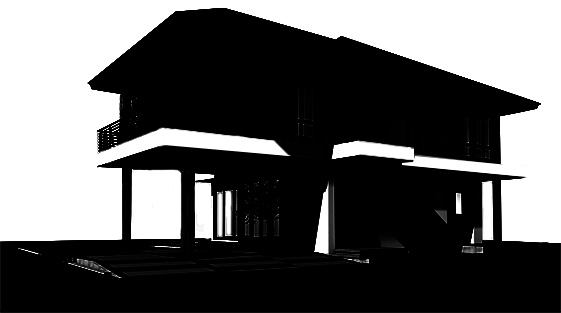
Whitespace can be strategically used with layout and composition to help draw the eye towards key spatial context or visual information. It’s more than just background for visual content; it adds balance, highlights visuals and Calls to Action, improves legibility, and is a am an all-around vital tool for designers.
Whitespace can be:
Active: Intentionally used to create a structure and layout for the design, and defines elements.
Passive: Default negative space that makes the content more understandable.
Visuals
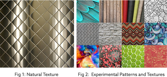
Visual design has an instantaneous impact on how products and marketing content is perceived and is considered the most important type of business content according to 32% of marketers. Professional, impactful visuals start with choosing and integrating textures and patterns.
Textures and Patterns: 90% of patterns and textures are human produced. Texture adds life and dimension to design and enhances the creative impact (Fig 1). Patterns provide visual mystery and diversity (Fig 2). When combined, texture and pattern create depth and physical sensation for the surface of visual objects.
Simplicity
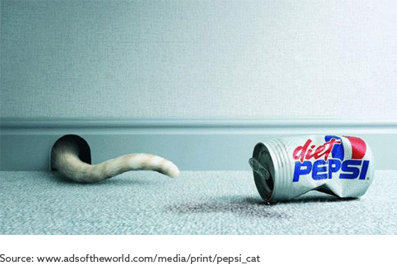
Similicity layout generates curiosity and drama through clean layout and simplistic two or three color scheme and use of generous white space. Designers should focus on conveying a single idea instead of many and not overpower the design concept with excessive visuals.
Rules of Design Composition and Layout
The Grid
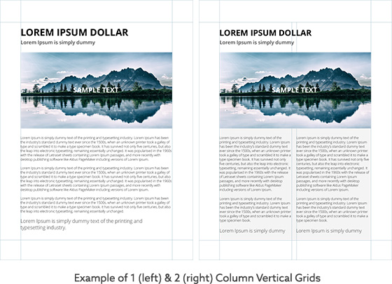
Works for any design project, including magazines, newspapers, brochures, websites and product packaging. There are two grid types: those with an even number of columns, and those with an odd number of columns. Designers can use even and odd grid columns to ensure that a design is successful.
Emphasis and Scale

Designers need to determine where the design’s focal point resides so that the composition can be structured effectively and create a sense of hierarchy. It helps to communicate to viewers that a certain figure or object is the focal point. This could mean situating the focal point as the largest object in the design, emphasizing the focal point by blurring the background.
Rule of Thirds
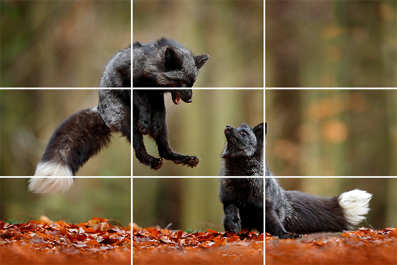
Also known as the Golden Ratio, this composition tool is often utilized by photographers. A natural, attractive arrangement and dynamic composition are established if a composition is divided into thirds, both vertically and horizontally, and the main image elements are situated either along the lines or at the junctions of them.
Rule of Odds
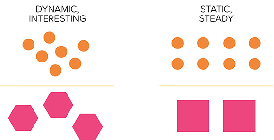
Uneven numbers in a design composition, usually three, are more interesting and attractive for viewers, so using an odd amount of elements can establish compelling visuals for website pages or apps. Conversely, even numbers can create a sense of stability and confidence.
360 Degree Design View for Impactful Graphic Designs
Graphic Designers have more than just technology at their disposal when creating powerful, well-composed design layouts. Critical, observational, analytical, and quantitative reasoning supplement artistic judgment and imagination and lay the groundwork for fundamentals of graphic design.
Graphic design essentials communicate goals, concepts, and business ideas in logos, brochures, posters, advertising, websites, and more, and can promote a brand’s reputation and convey an entire idea with minimal visual cues.
Professional graphic design companies have a 360-degree view that allows them to provide the best combination of expression, creativity, and immediate visual impact through the design-driven application of the latest technology and tools. As a full service, an international graphic design agency with ten years setting industry standards, Artwork Adobe (AWA) brings design elements to life through the creative visual interpretation of businesses concepts.
– ArtworkAbode
Artwork Abode

