Just like its contents, bakery package design needs to be equally appetizing in order to stand out amongst its competitors and become something truly memorable beyond just the taste of the product alone.
From a Designer’s perspective, it’s a tricky balance between having something aesthetically pleasing whilst considering more practical factors such as maintaining the freshness of the product. All whilst managing to protect the often delicate contents from damage in the case of more fragile goods such as cupcakes and pastries, which depending on the item may require more robust materials in the design.
There is also the consideration of cost and keeping retail prices competitive whilst keeping manufacturing costs under control. The key from the start is to identify the core message of the brand and the best way to execute this into a successful working product on the shelves, or indeed bakery as the case may be.
Utilizing Space to Deliver a Hidden Message
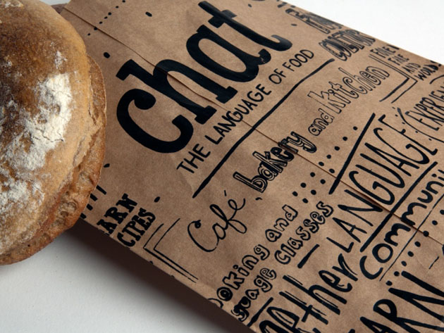
Even the simplest of materials associated with your packaging can be used to promote a message and inject personality into your brand. The space in which you have to play with can also be utilized to your advantage, even if the material is as simple as a brown paper bag. For example, the work by Graphic Designer Katie Vaz for the brand Chat.

Whilst the overall style and design would naturally vary quite considerably depending on the company, having someone read and notice what would normally be considered to be an inanimate object, is a great way to catch the attention of the consumer in a way they don’t expect. In addition to this, it’s also a great way to establish a brand identity particularly if it is an independent chain in the case of Chat.
As you read through the details on the front, you can see they have used this space to advertise their cooking classes, and that they are a cafe, bakery as well as a kitchen. This might appear to be small details on the surface but could quite easily offer a lucrative return if the right person happens to be reading it.
A clever aspect of the design is its subtlety. It’s a way of advertising more about the company, yet in a way which doesn’t demand attention – rather politely requests it. Often the consumer is bombarded with advertising, especially within a retail environment so the softer more subliminal approach can never be underrated or underappreciated when considering packaging design.
In the case of this example, it’s not just acted as a method of transportation for the item but also as a walking billboard too, all whilst helping to carve out an identity for the brand at the same time. So in retrospect what may seem like just a few doodles on a piece of paper, actually is so much more and harks back to the idea that many of the great ideas over time, have been scribbled on the back of a napkin or a piece of paper in a restaurant.
“Package Design can become marketing ambassadors to the company. It’s not just about creating a beautiful pretty package. It’s so important that it becomes part of the marketing mix” – Linda Casey, Package Design Magazine
Thinking Inside the Box
When we look to eat products such as cookies, we often subconsciously crave that warm “like Grandma used to make” feeling. Thelma’s are a bakery in Iowa who looked to meet that need amongst its patrons, by hand delivering boxes of freshly baked goods in a box, which quite literally gives you cookies straight out of the oven.

A simple concept on the surface, yet one which is effective at not only delighting customers, but functionally is useful in keeping the products warm, easy to store and deliver. It’s also a great way to make the association and that emotional connection between something which in the case of Thelma’s – makes it so much more about the design of the box, rather more what it symbolises to the customer. Tapping into that with a brand and creating a functional product which captures the imagination will help establish a core message which sets it aside from competitors, but will also help it stand the test of time in an ever-changing market.
“If you can create a brand that has that much of an immediate, emotional connection that’s where it becomes incredibly rewarding” – David Brier, DBD International
Avoiding the Cliché’s
Inevitably baked goods will always be associated with certain connotations which whilst are not unpleasant, tend to fall in similar categories. Establishing package design when it comes to figuring out your branding strategies can require a sense of boldness in order to be heard above the rest, and ultimately stand the test of time.
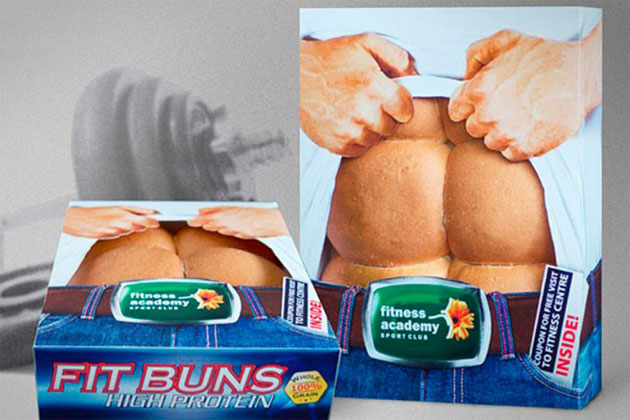
Introducing “Fit Buns” – A concept created by a local gym who were looking to boost membership levels in their local neighbourhood. By re-imagining the product and instead turning it into a successful piece of guerrilla marketing, they not only generated a 115% return on investment but implemented a product that sold an idea along with the bread.
Such a unique twist on a product can have a far-reaching impact, and most importantly is memorable to the customer. It’s a product people want to pick up and buy, but also share with their friends on social media, thus increasingly the products global reach instantly. Possibly the cleverest aspect is that the concept is actually quite simple, and works because it’s easy to understand and doesn’t try to be clever – it just is.
Conclusion
One of the things that cannot be forgotten when developing concepts for package design is that whatever you come up with, will literally carry your product and in more ways than one. It is a chance to really embody who you are as a brand and what you want to say about your product so is an opportunity not to be taken lightly.
To discuss solutions and development for your project, contact Artwork Abode with your requirements.
– Artwork Abode
Artwork Abode


