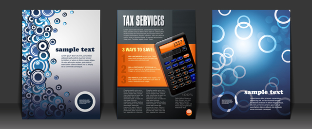
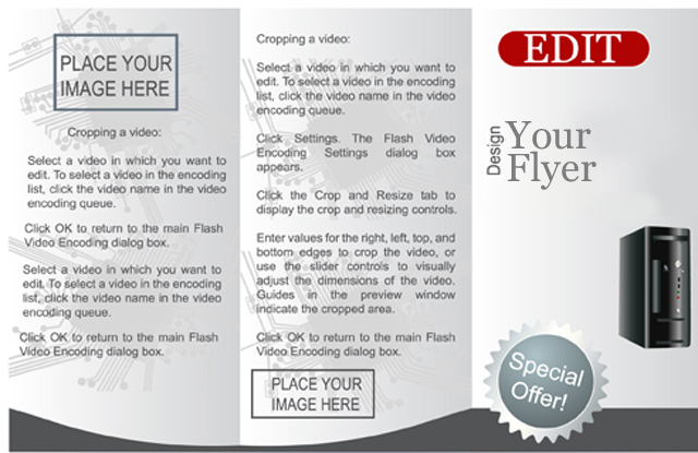
When it comes to the traditional ink-and-paper aspect of graphic design, the basic one-page flyer still reigns supreme as the single most-commonly selected distribution vehicle for basic marketing and promotional communications.
Whether announcing the latest product release, or reminding office staff about an upcoming luncheon, flyers make it easy to deliver deadline-oriented information to many people at a price that fits into even the most meager of business graphic design budgets.

Another reason for the enduring appeal of a basic flyer layout is that it fits perfectly within a standard-size sheet of paper, and is easily handled wherever it goes. Virtually every printer available, even entry-level models are capable of printing files designed for standard-sized sheets of paper.
And, with many offices operating color laser printers, vibrant, high-resolution color copies are distributed to end-users with convenience, as a cost-effective solution for essential business marketing that only a flyer designed with thought and care by a graphic designer will achieve.

Flyer Layout A Challenge For Graphic Designers
However, the same features that make flyers an attractive choice for business communications are often the prime contributor that makes designing them a real challenge, even for the most practiced graphic designer. The reason is that the cost-effectiveness and utility of flyers generally attract those clients who are looking to run a promotional campaign on a budget that has no room for one.
Strict mandates to get the most value for money spent often means overloading page layouts with excessive text due to the common more-is-better theory of perceived value. The inexperienced graphic designer compounds the problem by feeling required to make use of every last bit of information the client provided, and forces it all on the page.
Unfortunately, overloaded pages diminish value by losing the message in all the clutter.
1 Easy Step: A Simple Edit

Graphic designers create a more effective end product when they take the time to offer their clients suggestions for editing unnecessary text, or better yet, removing it entirely.
Many clients are only too happy to accept editing help so long as main points of the message remain intact. They welcome a graphic designer’s expert opinion on layout because, not only does it make a better product, but it also helps the client look better in the eyes of their peers. This aspect alone can help bring repeat business through the graphic designer’s door.
Simple edits in the right places make all the difference between a flyer that gets results and one that gets discarded. Rephrase sentences or thin verbal clutter in a paragraph with an eye towards clarifying the message obscured by all the words. These simple edits create a dramatic difference in how effectively the finished product delivers its message.
Other key areas to watch for are redundancies, poor grammar and typographical errors. For example, one promotional flyer put the date and time in the heading, which is good practice. But it also had the same information in the body copy. Eliminating this redundancy helped open up a verbose page, and made the layout cleaner. One simple edit made everyone involved with the process look more polished and professional.
Get Approvals before Creating the Layout
Once you’ve distilled the copy to its most important elements, and have a clean, potent block of copy to start using in layout, be sure the client or anyone else directly responsible for paying for job, and provide their final stamp of approval on your changes.
Incorporating unauthorized changes into a layout without approvals could end up being a frustrating waste of time if the client refuses to accept a layout that took hours, or even days, to complete.
– ArtworkAbode
Artwork Abode


