Logos can have a huge impact in political campaigns as every candidate is essentially a brand. Often, a busy team is at work behind every Presidential candidate including campaign managers, speechwriters, and press teams. This team also includes highly-skilled graphic designers who work non-stop to develop visually sound campaigns. Artwork Abode brings you some of the most recognized political brand logos in the U.S. including the latest logos launched by candidates who have announced their running for US Presidency in 2016.
Democratic Party Logos
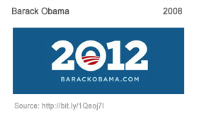
This logo was developed by Blue Star Digital. The designer commented: “It was critical that we connected the emotions of 2008 with both the presidency and the new campaign in a way that made Obama’s entire efforts feel like a single, compelling story.”
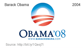
This logo was developed by Sol Sender, a graphic designed, who stated: “Before we even arrived at the final identity we were aware of developing a number of options that had an element that stood separate from the typography. For me personally, this was always the one.”
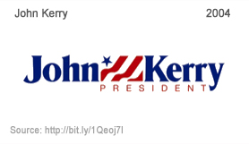
Democrat designer Scott Dadich commented that the logo of Senator John Kerry’s Presidential campaign was “inconsistent, wimpy, and a weak echo of Bush’s.” A steady visual message requires the consistent use of the same font over and over again, he added.
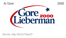
Gore’s logo was found to be easier to the eye with the lighter blue, compared to Bush’s. Nevertheless, the people of America chose to vote Bush that year.
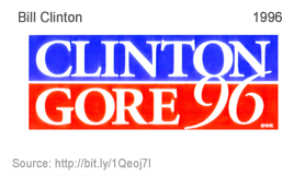
Observers felt that the 1996 logo of President Clinton was not as effective as his 1992 campaign’s logo because it was more descriptive than his opponent Dole.
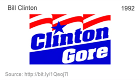
“Striking colors, but they complement each other” was the comment of most design experts on Clinton’s logo.
Republican Candidate Logos
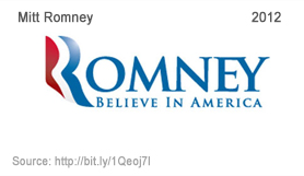
Andrew Kaczynski commented that Mitt Romney’s didn’t feel quite as fresh as Obama’s iconic “O”— despite its striking resemblance to the logo for Aquafresh toothpaste. The Romney font is set to Trajan, which is the same font used for Lord of the Rings, Titanic, The Mummy and Star Wars Episode II.
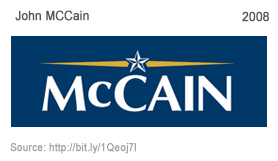
Steven Heller commented: “While it is not the most robust sans serif ever designed, it is not entirely neutral either. It embodies and signifies a certain spirit and attitude. And if a typeface is not just an empty vessel for meaning, but a signifier that underscores personality, then it is useful in understanding what the candidates’ respective typefaces are saying about them and their campaigns.”
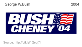
According to Scott Dadich, “Americans are conditioned to equate visual brevity with success and power. One need only look at the landscape of corporate America for confirmation. It’s appropriate that Mr. Bush allowed his middle initial to work for him, and a testament to the letter’s power that the opposition has co-opted it for its own use, though it is circled with a slash through it.”
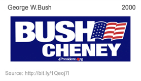
“It’s brash and snazzy: a field of powerful, militaristic navy blue punctuated with the four letters of his surname spelled out in white in what appears to be Folio Extra-Bold Italic letters” said Dadich.
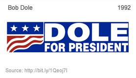
Bob Dole plainly included his and his running mate’s names in the logo.
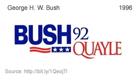
Clarity of the entire work has evidently contributed to taking the campaign message forward for President Bush Senior.
Conclusions
In today’s age, websites also have become a necessity for assuring political victory. This has automatically given rise to the need for creating high-impact logos. YouGov, recently surveyed and published the feelings about four 2016 presidential candidates’ logos irrespective of their politics.
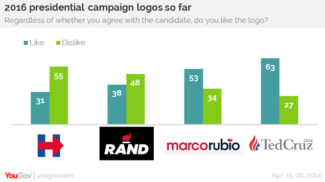
These statistics show how logos matter even for the common man who votes, who may not be digitally savvy. Whether it is politics or business, logos matter. Well, let’s see how these latest logos will make an impact in the the 2016 elections. We welcome your comments below and please take a moment to share this article by using the social share buttons on this page. Best wishes to all the candidates from Artwork Abode design team!
– Artwork Abode
Artwork Abode


