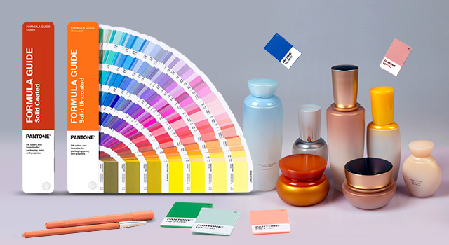
Getting colors to match across the board on complex materials is a major obstacle that manufacturers have struggled with for years. Color matching is a big challenge in packaging design, and using Pantone colors for plastics makes this even more of a challenge. Rather than expressing colors using arbitrary names, designers can use the Pantone matching system to ensure their design carries over to the final product packaging. Of course, it is much easier said than done.
Color examples must be tested thoroughly on plastic so that designers understand how the material reacts to the chosen colors. Communication and testing are essential, so let us look at some steps organizations can take to simplify the process.
Testing Pantone Formulas For Plastics Before Production
First and foremost, it’s essential for product packaging designs. It’s the only way to guarantee that the chosen color has the desired visual appeal after printing it onto plastic. Color matching for plastics is much more complex than other designs because so many elements are involved. You might see plastic casing deployed around cardboard cutouts or metal banding wrapped around a plastic shell. Plus, packages often incorporate different elements into their design.
When mixing these surfaces, the imbalance of colors across two different materials can throw off the entire design. In short, the colors might appear differently on-screen once you print them with Prepress.
Color matching uses the Pantone matching system or visual matching with color samples. Both are essential elements in package design.
- Pantone Matching System: A Pantone book is filled with colors in all spectrums, each with its corresponding Pantone color code. Some advanced Pantone books provide examples using different materials.
- Visual Matching: Visual matching uses small samples of materials on the packaging. This match gives designers a side-by-side look at how the color reacts across two distinct surfaces.
Top designers generally use a combination of both methods when designing brand packaging.
Use a Spectrophotometer for Accurate Results
Spectrophotometers are one of the top tools for matching Pantone colors for plastics. They translate color into a series of numbers that allow them to quantify without relying solely on visuals.
Top designers use a spectrophotometer to stay consistent across all designs. Experts say that although colors might match closely in terms of formulas, they might appear quite different visually. There are too many factors involved to rely on any tool alone.
Color matching isn’t an exact process, so it’s essential to use several tools during the process. In addition to a spectrophotometer, many designers will visit a toy store or cosmetic store to find products that match their desired color. They then present these to the production department for reference.
Communication Requires a Standardized System Like PMS Plastic Chip Collection
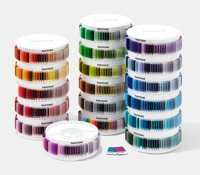
Once the correct color is selected, adequate communication is needed. There is such a wide range of instruments available that this information can easily get lost between locations. A different spectrophotometer can give slightly different results. If two locations use different spectrophotometers, they will produce slightly different colors. This might seem insignificant but will quickly appear once applied to plastic packaging.
That’s why using a Pantone chip standard is such a powerful option. It ensures that all necessary steps follow through with the same color. It relies on a universal system, so communication stays consistent. Once a designer chooses a color, having a universal metric like the Pantone Chip Standard ensures that the color remains constant.
Technology will Help Guarantee Consistency

The digital age has given birth to specific technological innovations that make it easy to match Pantone colors for plastics. The most popular brand is X-Rite. These technologies ensure that color communication stays consistent across all elements of the design process. As we have discussed, communication is a crucial aspect.
Technology also reduces cycle time for improved accuracy, making it essential for high-production manufacturing environments. Also, having access to technology like X-Rite eliminates a lot of the time-consuming testing involved with matching color profiles.
Conclusion
The Pantone matching system has become the standard for color matching for plastics because it standardizes the entire process. It takes out all the guesswork and ensures that communication across locations is consistent. Without a compatible color-matching system, you could end up with inconsistent product packages sitting on the same shelf in the store!
Using Pantone colors for plastics gets everyone on the same page and makes the entire product package design process much more manageable. Ensure that your brand’s image is consistent across all products by using the Pantone matching system across your design process.
To help businesses meet package adaptation requirements, Artwork Abode works hand-in-hand with corporate executives and marketing managers to ensure the entire product packaging design process moves smoothly from start to finish.
Artwork Abode

